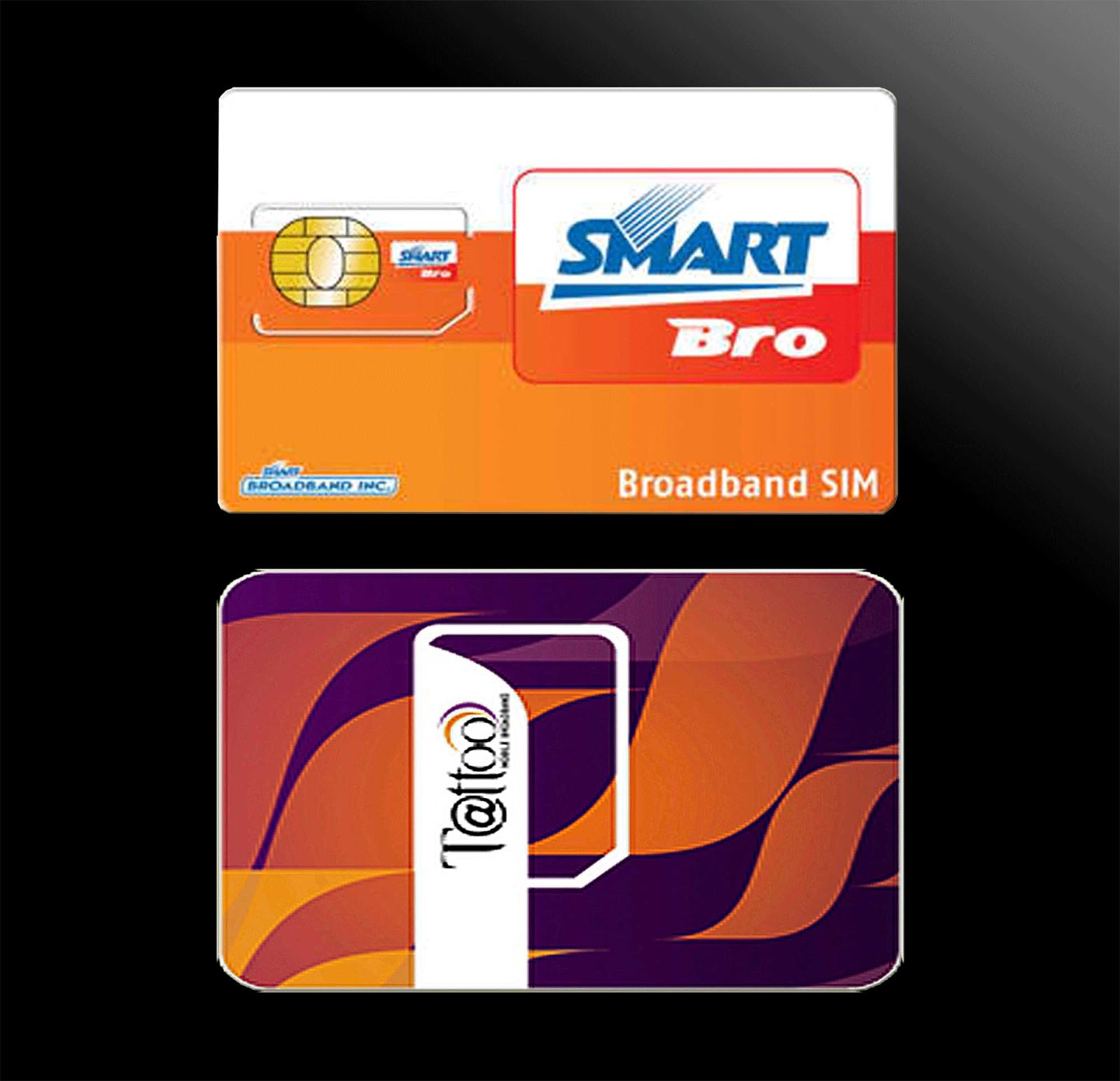
Mobile and Tablet Devices Review

Cyber Living posts the specifications or details of the latest mobile phones and tablets with some thought comments on the device You can find them by clicking the MOBILE?TSBLET DEV on the menu bar above. Or you can click this link Mobile and Tablet Devices

Computer Problems Solutions

For personal computer/notebook problems and tips, refer to PC PROB from the menu or click this link Personal Computer Problem Solutions.

What's in the world with Philippine ISPs

Discussions about Philippine Internet Service Providers (ISPs) particularly problems users are encountering but are not getting any solutions.

  • Tips or work around to these problems to improve browsing experience.
  • Do you have any problems too? Give your comments below each of the posts to be heard.
  • Or better yet, send me a message on our contact form if you want a dedicated article to your problem on this site.
  • Bloggers and Webmasters tips/tricks

    Looking for something to implement to your site? Our Bloggers' tips/tricks have what you need. If you do not find it there, notify us through our contact form.

    SEO Tips

    Tips to improve your rankings on Search Engine Resuts Pages (SERPs).

    Wednesday, August 14, 2013

    Coby Kyros MID7047 Android 4.0 Tablet


    Coby Kyros 7047-4
    Coby Kyros 7047-4 overview | source: http://www.cobyusa.com
    Coby 7.0" MID7047 Android Tablet


    Here is an unexpensive Android tablet running on Ice Cream Sandwich designed for budget customers. This is made for those looking for a low budget tablet that has the basic capabilities like web browsing, music playback and playing some basic games.

    Here are some positive notes about this Tablet

    • 7.0" Multi-touchscreen - easily zoom with two fingers as well as other capabilities of a 2-point multi-touch device.

    • Wi-Fi Support - connect to the internet wirelessly through its 802.11 b/g/n comm port.

    • Wide range of media support - play most of the internets sound, video and photo formats.

    User experience:
    No one is talking about this tablet yet. Be the first to comment.

    • Pros
      1. Affordable
      2. With microSD expansion capability
    • Cons


      1. Narrow viewing angle
      2. Not a real Android Tablet as it does not even have access to Google Play.
      3. Lags at times

    Here is the complete list of its specifications:

    Operating System Android 4.0 Ice Cream Sandwich
    Processor / ChipsetCortex™-A5 (Telechips)
    1.0 GHz
    Graphic
    Display7.0” TFT LCD (WVGA 800 x 480),  capacitive Multi-touchscreen, 16:9 aspect ratio
    TouchscreenYes
    LCD Features


    MemoryFlash; 512MB
    Hard DriveBuilt-in 4GB/Expandable up to 32GB
    HDD Interface
    ColorBlack
    MultimediaBuilt-in Microphone
    Integrated Speaker


    CommunicationWi-Fi IEEE 802.11 b/g/n
    ---
    PortsUSB 2.0 High Speed (Micro Connector)
    3.5mm Headphone
    MicroSDHC


    InputTouchscreen
    PowerAC 100-240VAC INPUT, DC 5V output
    ---
    Dimension7.75 x 0.45 x 4.5
    Weight7 lbs.
    Software
    *Software can be changed without notice


    OthersPlays/displays common internet audio/video/Photo formats.
    Available in the following languages:English, Spanish, French (Canada & France), German, Chinese (Simplified and Traditional), Italian, Portuguese (Portugal and Brazil), Korean, Japanese, Russian, Hebrew, Greek, Arabic
    CE, FCC certified
    ---
    ---
    Warranty---
    ---
    Samsung Support Pagehttp://www.samsung.com/us/support/owners/product/XE700T1C-A01US
    (includes manual downloads and FAQs & How Tos)


    Back to CyberLiving home page

    Other Posts

    Monday, August 12, 2013

    What are light boxes and how can you make one?

    Ever wondered what are those square floating boxes that appear in front of the contents of a page when it is loaded or when you click a link like a thumbnail of a photo or a small window inside the current window?  It is called a lightbox.

    A lightbox is very handy when you want to show the content of a link but you do not want them leaving a page. One reason why you might not want your reader to leave a page is because many find it troublesome to go back to a page when they are taken somewhere else even if it is on a different tab or a new window.

    Lightbox is also very useful if a page mostly contains links like in the case of a stock photo page where a user will be looking for many different pictures from the displayed list. Imagine how combersome it would be to be going back from tab to tab or window to window on every sample photo.

    What makes a lightbox
    Basically, a lightbox is only a div element that is positioned above everything else within a page. It is styled in a way that it would look like a new, smaller window inside the browsing window.

    How to make one?
    I want to create one and put it in my site, how can I do it? I hear you say. Below I will describe how it is done.

    Like what was already said earlier, a lightbox is only a div element with the proper styling applied to it. So go ahead, define a div element and give it an id as you wish or you can simply call it lightbox like this:

    <div id="lightbox"></div>

    This of course will not show anything in your screen. Next, define some format to it using CSS like boder width, color, width and height of the box like this:

    <style type="text/CSS">
    #lightbox{
     border: 10px solid yellow;
     width: 400px;
     height: 250px;
    }
    </style>

    #lightbox means these formats will be applied only to the element with an id of lightbox. All the formatting is enclosed with these { }. border: 10px solid yellow; means the border will have a width of 10 pixels, it is solid (not dashed, double or any other type) and it is color yellow. width: 400px; means the width of the window is 400 px and height: 250px; means the window will have a height of 250 px. It would then look like this:


    Let us add a close button
    If you have been observing the internet some uses a circle with an X in it to indicate the close button or a solid square box with also the X on it and some simply uses the word close. All are on the upper right hand corner. I am in the mood for the circle close button so let us do that.

    First create a circle, on how to create one, refer to the guide on creating lines. Fill this circle with the same color as the adjacent element's background (later we will be adding a title bar with orange background so we will fill our close button with orange) but instead of an X, let us place the word close instead. It will look like this:

    close

    The code is this:
    html part:

    <div id="circlecontainer" style="width: 40px; height: 40px; position: absolute; top: 15px; left: 412px;"><div id="close_button"><div style="font-size: 9px; position: absolute; top: 14px; left: 11px;">close</div></div>

    </div>


    CSS Part:

    #close_button{
     width: 20px;
     height: 20px;
     background-color: orange;
     border: 10px solid yellow;
     border-radius: 20px;
    }

    The div with id="circlecontainer" is to group both the circle as well as the word close so it is easier to handle it later in case a javascript is used to on it. The CSS part is mainly for the circle. There are also in-line CSS in the HTML part mostly for aligning the elements together.

    Now put them together in a way that the circle is on top of the lightbox window. We will also make the corners of the lightbox rounded and add a title bar with an orange background color. The following lines will be added:

    First position the circle to the upper right corner of the box by using position: absolute then top: xxpx and left xxpx placed in the CSS for the close_button. The xx are values that will line-up the close-button best to the box.

    Next round the corners of the box by adding corner-radius: 15px. Then to add the title bar, add another div element within the div of the box. Give it a height of 30px and background color of orange. In here we will use again in-line CSS (remember to round the upper corners a bit to match the rounded corners of the box):

    <div style="background-color: orange; height: 30px; border-radius: 5 5 0 0px;"><b>Title Here</b></div>
    So it will look like this:
    Title Here
    close


    Our lightbox is completed. My color selection may not be the best to use for a lightbox. Do some research by looking at what others are using the change it to that color that makes you happy. Also ad content to the box by placing them between the closing div (</div>) of the title bar and the closing div of the main box.

    The last thing we need to do is to make the close button function as it should (close the window). To do this we will use javascript to hide the entire box using the display: none property. By using display : none, it is not actually being closed but only being hidden from view. First group it all by containing it in a single div element then refer to its id when in javascript to hide it. Below is the final code:


    <script type="text/javascript">
    function closeIt(){
    document.getElementById("main_container").style.display = "none";
    }
    </script>

    <style type="text/CSS">
    #lightbox{
     position: absolute;
     top: 40px;
     border: 10px solid yellow;
     width: 400px;
     height: 250px;
     border-radius: 15px;
    }

    #close_button{
     width: 20px;
     height: 20px;
     background-color: orange;
     border: 10px solid yellow;
     border-radius: 20px;
    }
    </style>

    <div id="main_container" style="display: block;">
    <div id="lightbox">
     <div id="title_bar" style="background-color: orange; height: 30px; border-radius: 5 5 0 0px;"><b>Title Here</b></div>
    </div>
    <div id="circlecontainer" style="width: 40px; height: 40px; position: absolute; top: 15px; left: 412px;">
    <div id="close_button"><div style="font-size: 9px; position: absolute; top: 14px; left: 11px; cursor: pointer;" onclick="closeIt()">close</div></div>
    </div>
    </div>

    There you have it. Make your adjustment as necessary.

    Back to CyberLiving home page

    Other Posts

    Saturday, August 10, 2013

    Is PLDT's (Mybro/SmartBro) Fair Usage Policy (FUP) fair?

    If you are currently a MyBro (formerly SmartBro) subscriber, then you already know and experienced what I am about to tell you. But still indulge me so that you may get additional insight about the matter and please do share this article to others so that they get informed. By spreading the word, we might make PLDT/Smart to rethink about its Fair Usage Policy.

    If you are not yet a MyBro (SmartBro) subscriber, you are in luck. Please read carefully and when you fully understand what has been written here you still wish to subscribe, then all the best to your browsing in the coming months.

    From the TV ads, Smart has been using the term unlimited to their MyBro plan 999. No matter how you try to interpret this, it will always mean that you get unlimited internet access with up to 2Mbps. Please note of the phrase up to that just because the 2Mbps is there, mean that you will get 2Mbps internet speed. I will let other users to comment on it but just to give you a hint, a 1Mbps speed would already be very good.

    myBro (SmartBro) Plan list
    List of MyBro plans including their monthly data usage limit. Plan 999 and 1299 states unlimited.
    But wait, let us go back to their much trumped umlimited data usage. myBro has this thing called Fair Usage Policy (FUP). What is this and why would you care? Well, because this means each month you are actually limited to only so much download and upload (combined) data per month. How much? Many says it is about 15GB a month but PLDT has a very vague description of it. Below is an excerpt of it:

    "Conditions Covering Fair Usage Policy. Certain peer-to-peer and machine-to machine software/applications are used by customers to send and receive files containing very large amounts of data. These activities may cause network congestion and can negatively impact the quality of service that other subscribers will experience. myBro fulfils a service level that is based on equitable share of network resources among all of its customers. Thus, the service level and/or connectivity to users of peer-to-peer and machine-to-machine software/applications is modulated to ensure that all customers get the best fixed wireless Internet experience.
    Upon reaching the optimum volume allocation for a single user, the subscriber will still be able to enjoy unlimited access to the Internet, but at a lower speed. This was implemented to manage overall internet usage and to ensure that all myBro subscribers can enjoy satisfactory internet service."
    Well, to be fair, it stated that you will not get disconnected but your speed will be reduced then by the next month, all will be back to normal. But many will attest that by reduced, it means it will go down to a crawl that a dial-up would even be better. So much for unlimited huh?

    The reason for such a policy they say was for them to ensure the integrity of the network so they can continue to provide a fast and reliable connectivity and that all subscribers will have fair access to network resource. How noble, but say what?!

    First off, why use the term unlimited to a service that is actually limited? At least they should have the decency to say that all users are subject to myBro's fair usage policy. Why are users being penalized for their usage patterns for an unlimited service that has been promised them? Why does Smart not upgrade so they can provide better service instead of penalizing them for downloading so much for using their (I will say it again) unlimited network service? If upgrade is not an option, then don't accept anymore subscriber. Shouldn't this be more fair?

    Secondly, people use the internet a lot these days. They use facebook, skype (or any other VOIP services), e-mails, youtube, online games, system/software updates, file downloads (like e-books), the cloud (iphone music for example) and yes peer-to-peer sharing. Accept that all these are just normal for a user to be doing over the internet aside from the usual Google search for a how to, what is or for the latest news/gossip. Ask anybody if it is normal to be using peer-to-peer software and you will get a resounding YES. What then, will Smart want to change this behaviour? Like I said, stop using the word unlimited that way no one will get deceived and state flat out how much data they are allowed to use each month.

    As if that is not enough, they added:
    "myBro reserves the right to suspend or terminate service to customers whose practices or use of the internet far exceeds that of a personal consumer and, as a result, impairs the quality of service that other customers experience. myBro also reserves the right to modify the Fair Usage Policy without immediate notice in order to maintain the integrity of its network services."
    If I am to understand it, it is all up to them to do no matter what they please so that they could provide a fast and reliable service. Ah! All in the name of good service. Is that what you can call fair? Fair to whom?

    How about existing subscribers prior to the implementation of the Fair Usage Policy? They were promised unlimited network access, no conditions. Unlimited, period. Why apply to them? I almost forgot, they reserve the right to modify their policy, right! Well, could Smart at least give them the right to opt out from the subscription even within the lock-in period? The answer is a resounding NO.

    OK I am done babbling about this policy. But just to give some insight as to  how far a 15GB will last for an average user (note, not a power surfer) here is a summary of usage with corresponding data. Please note this are only estimates and in no way is it measured scientifically.

    Youtube (1min of video = 2MB; average youtube video per month = 1350 minutes that is 45 minute video per day) = 2.7GB <- note that you can download video faster than you can play them and most times you don't watch the entire length of the video especially if that video is not what you are looking for but you have already downloaded the complete video.

    Facebook (50 pictures upload/month at 6MB/picture; 15MBper page @ 150page/month; 3MB per photo view@ 400 photo/month = 300MB + 2.25GB+1.2MB or roughly 3.75GB/month.

    Skype (2.2Gb/hr; 20 hours/month) = 5.5GB/month <- me and my wife use more (way more, like 4 times more, than this every month).

    Online Games (approximately 50MB per hour at 50hours/month; hahaha a little more than an hour a day of gameplay but indulge me) = 2.5GB/month

    System/Software updates = roughly 1GB/month

    This alone will already give you 15.4GB of downloaded data and that is a very conservative estimate. How about the bits of cookies and such that are also downloaded not to mention that each page you visit, you are also uploading some data. I also have not included a user's numerous Google search as well as page visits to different sites. Note that this is only for a single computer. What if you have more than one connected via a router? And let us not forget peer-to-peer download which could easily use 10GB in a month.

    Lastly, to be fair, it is also worth noting that myBro is not alone in implementing a data limit. Globe as well as others have also their own data limit.

    My advise learn your surfing habit and if you think you are within this limit then you can try subscribing otherwise look for an alternative. A local ISP perhaps that has no data limit or at least higher limit? But if you don't have a choice and you are a heavy user, then I feel for you. You may try prepaid plug-it and subscribe an UNLISURF 200 good for 5 days. I have inquired through their service representative and to this day,  this is still not covered by the FUP but most of the time it is also very slow (at least in my case). Just don't buy the dongle with a very limited settings selection in its UI like MF180 and MF190 by ZTE. It automatically connect once it is plugged and there is no way you can disable its autoconnect. I have that experience with the MF180, trust me it is a pain to use. Loosing my load before I could register it to UNLISURF.

    Let me ask again, is the Fair Usage Policy fair?

    Back to CyberLiving home page

    Other Posts
    Back to home page
    Thursday, August 8, 2013

    How to draw lines using CSS

    Do you want some simple lines (vertical, horizontal,diagonal or slanting) but without using images?

    It is quite simple really. By using CSS, you can create the above listed lines as well as circle.

    Let us start with the simpler ones, that is horizontal and vertical lines. To do so, simply create a div element and define the border on one side and you already have a line then define its position so you can place it at the exact location you wish the line be displayed by using a combination of the top, left, bottom, right properties together with the position: absolute, position: relative or position: fixed.

    Vertical line example:
    <style>
    #vertical
    {
     height: 200px;
     border-left: 1px solid blue;
     position: absolute;
     top: 50px;
     left: 250px;
    }
    </style>

    <div id="vertical"></div>

    *You may also use border-right with the same values and it will have the exact same result. The bigger height it is the longer the vertical line.

    Horizontal line example:
    <style>
    #horizontal
    {
     width: 200px;
     border-top: 1px solid blue;
     position: absolute;
     top: 50px;
     left: 250px;
    }
    </style>

    <div id="horizonal"></div>

    *You may also use border-bottom.

    For a diagonal line first create a vertical or horizontal line then add the rotate property.

    Diagonal line example:
    <style>
    #diagonal
    {
     width: 200px;
     border-top: 1px solid blue;
     -webkit-transform: rotate(36deg);
     -moz-transform: rotate(36deg);
     -o-transform: rotate(36deg);
     -ms-transform: rotate(36deg);
     transform: rotate(36deg);
     position: absolute;
     top: 50px;
     left: 250px;
    }
    </style>

    <div id="diagonal"></div>
    *A diagonal line is a horizontal or vertical line that is rotated at an angle.
    **The -webkit-transform: rotate(xxdeg), -moz-transform: rotate(xxdeg), -o-transform: rotate(xxdeg), -ms-transform: rotate(xxdeg) and transform: rotate(xxdeg) all do the same thing. But each only works for a specific browser.
    ***Always supply the same angle to all, otherwise it will be displayed differently on different browsers.

    For a circle, it is still a div element with rounded corners.
    Circle Example:
    <style>
    #circle
    {
     height: 200px;
     width: 200px;
     border-radius: 100px;
     border: 1px solid blue;
     position: absolute;
     top: 50px;
     left: 250px;
    }
    </style>

    <div id="circle"></div>
    *To create a circle, the div element has to be a square thus height and width must be equal.
    **The value of the border-radius must be half that of the side (or half of the height or width value).

    Now let us use a combination of these to draw a very big stickman.


    <!DOCTYPE html>
    <html>
    <head>
    <style>
    #stick_head
    {
    height: 100px;
    width: 100px;
    border: 1px solid blue;
    border-radius: 50px;
    position: absolute;
    top: 200;
    left: 400px;
    }

    #body
    {
    height: 240px;
    border-left: 1px solid blue;
    position: absolute;
    top: 120px;
    left: 450px;
    }

    #left_arm
    {
    height: 130px;
    border-right: 1px solid blue;
    -webkit-transform: rotate(50deg);
    -moz-transform: rotate(50deg);
    -o-transform: rotate(50deg);
    -ms-transform: rotate(50deg);
    transform: rotate(50deg);
    position: absolute;
    top: 140px;
    left: 400px;
    }

    #right_arm
    {
    height: 130px;
    border-right: 1px solid blue;
    -webkit-transform: rotate(130deg);
    -moz-transform: rotate(130deg);
    -o-transform: rotate(130deg);
    -ms-transform: rotate(130deg);
    transform: rotate(130deg);
    position: absolute;
    top: 140px;
    left: 500px;
    }

    #left_leg
    {
    width: 180px;
    border-bottom: 1px solid blue;
    -webkit-transform: rotate(100deg);
    -moz-transform: rotate(100deg);
    -o-transform: rotate(100deg);
    -ms-transform: rotate(100deg);
    transform: rotate(100deg);
    position: absolute;
    top: 448px;
    left: 345px;
    }

    #right_leg
    {
    width: 180px;
    border-bottom: 1px solid blue;
    -webkit-transform: rotate(80deg);
    -moz-transform: rotate(80deg);
    -o-transform: rotate(80deg);
    -ms-transform: rotate(80deg);
    transform: rotate(80deg);
    position: absolute;
    top: 448px;
    left: 376px;
    }
    </style>
    </head>
    <body>
    <div id="stick_head"></div>
    <div id="body"></div>
    <div id="left_arm"></div>
    <div id="right_arm"></div>
    <div id="left_leg"></div>
    <div id="right_leg"></div>
    </body>
    </html>


    Of course this is not how you would use a line to style your page but just to give you an idea as to what extent you can do with it and what has just been demonstrated is the very basic. There are more that you can do with it specially when used together with javascript or similar language.
    Back to CyberLiving home page

    Other Posts
    Back to home page

    How to customize a Google Visualization Table to best fit your page

    If you are using Google Visualization Table to show your data like when making Google Spreadsheet as a database, you may have learned that customizing it is not simply declaring an ID to the containing element.

    The declaration google.visualization.table in itself contains its own CSS styles which defines what you see when the table gets drawn like background color, font size, font face and so on. There are readily available options that you can turn on or off like alternating background color per row but sometimes that is not enough as what is readily available may not be suited on how your page looks like.

    How to override the default styles
    For this to work the option allowHtml must be set to true. Also, there should not be any formatting on the source spreadsheet.

    For the purpose of this post, let us go back to a previous article that illustrates how to use your google spreadsheet as a database. Let us make this table transparent so that it will match and adopt your page's background color.


    • Define the CSS styles for the table elements - create a css class for the following: headerRow, tableRow, oddTableRow, .selectedTableRow, headerCell and tableCell. Set the the background color to transparent and since by default there is no border define one for it as well. Also, since all will be having the same styles, just lump them up in a single declaration within the <style> </style> tag. Here is an example:
    Example: 
    .hrowclass, .trowclass, .otrowclass, .strowclass, .hcellclass, .tcellclass
    {
     background-color: transparent;
     border: 1px solid #c8c8c8;
    }


    • Use declared classes in the table.draw using the cssClassName property - locate the javascript function containing the actual code that displays the table. In this case it is table.draw(data, {'allowHtml': true, 'alternatingRowStyle': true, 'page': 'enable', 'pageSize': 10, 'sort': 'enable', 'sortAscending': false, 'sortColumn': 0}); and add this 'cssClassNames': {'tableRow': 'trowclass', 'headerRow': 'hrowclass', 'oddTableRow': 'otrowclass', 'selectedTableRow': 'strowclass', 'headerCell': 'hcellclass', 'tableCell': 'tcellclass'}. The final result will be this:
    table.draw(data, {'allowHtml': true, 'alternatingRowStyle': true, 'page': 'enable', 'pageSize': 10, 'sort': 'enable', 'sortAscending': false, 'sortColumn': 0, 'cssClassNames': {'tableRow': 'trowclass', 'headerRow': 'hrowclass', 'oddTableRow': 'otrowclass', 'selectedTableRow': 'strowclass', 'headerCell': 'hcellclass', 'tableCell': 'tcellclass'}});

    Now save your work and you will have a transparent table with a gray background. You can even change the color of the border or make it thicker, add more styles as you see fit. Try playing on it to give you what you wanted.


    Back to CyberLiving home page

    Other Posts
    Back to home page